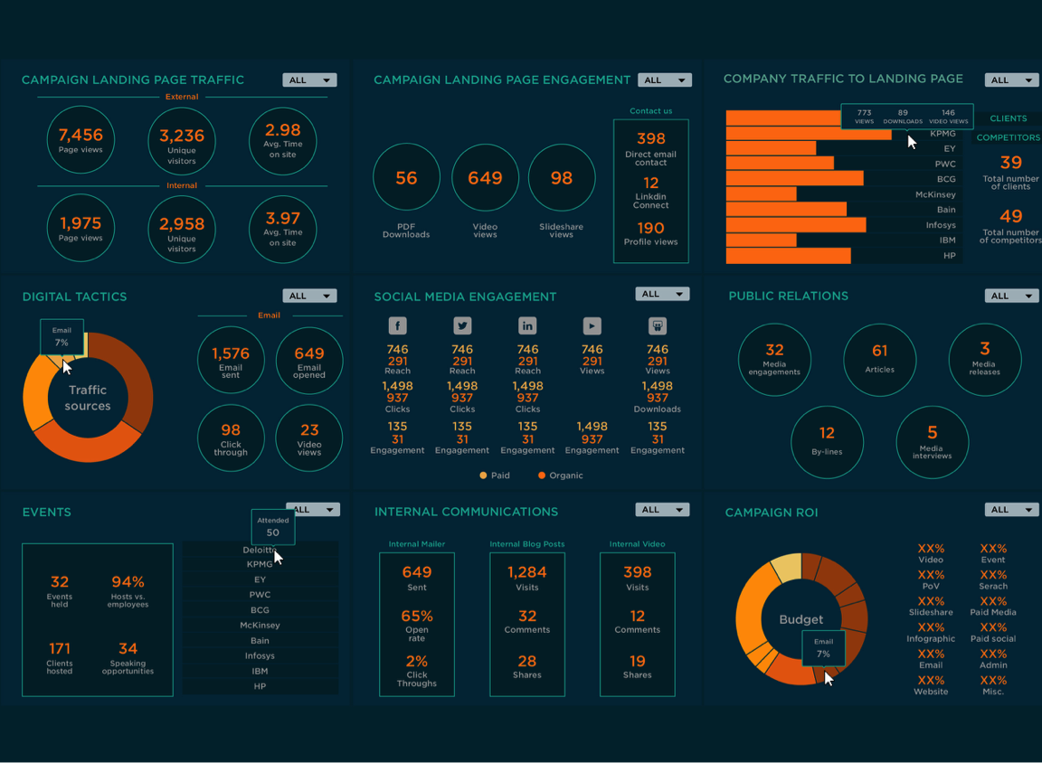
Dashboard Design Best Practices – , dashboards serve as crucial tools for visualizing information and facilitating decision-making. A well-designed dashboard provides stakeholders with immediate insights, enabling them to monitor performance and make informed choices. This article will explore the best practices for dashboard design, ensuring your visualizations are effective, engaging, and user-friendly.
Dashboard Design Best Practices : What is a Dashboard?
A dashboard is a visual representation of key performance indicators (KPIs), metrics, and data points consolidated onto a single screen. Dashboards are used in various industries to display critical information at a glance, facilitating quick decision-making and performance tracking.
Why is Dashboard Design Important?
- Enhanced Decision-Making: A well-designed dashboard allows users to quickly grasp insights, leading to informed decisions.
- Improved Communication: Dashboards facilitate clear communication of data trends and metrics across teams.
- Time Efficiency: Users can access essential information quickly, saving time on data analysis.
- Increased Engagement: Engaging visualizations can motivate users to interact with data more frequently.
Best Practices for Dashboard Design
Define Your Audience and Purpose
Understanding Your Users
Before designing a dashboard, it’s essential to identify who will use it and what information they need. Different stakeholders may require different views and data types.
Example: A sales manager may need a dashboard focused on sales metrics, while an executive might prefer a high-level overview of company performance.
Keep It Simple and Focused
Clarity Over Complexity
A cluttered dashboard can overwhelm users. Aim for simplicity by displaying only the most relevant metrics and insights.
- Limit the number of visualizations: Use only essential graphs and charts.
- Avoid unnecessary elements: Eliminate distractions like excessive text or images.
Use Effective Visualizations
Choosing the Right Charts
Different types of data require different visualizations. Use charts and graphs that best represent the underlying data.
- Bar Charts: Ideal for comparing discrete categories.
- Line Graphs: Effective for showing trends over time.
- Pie Charts: Use sparingly to display proportions.
Organize Information Logically
Layout and Structure
A logical flow helps users navigate the dashboard easily. Group related metrics and visualizations to create a cohesive structure.
- Hierarchy of Information: Place the most critical metrics at the top or in a prominent location.
- Consistent Alignment: Maintain consistent spacing and alignment for a professional appearance.
Use Color Wisely
Color Psychology
Colors can significantly impact the readability and effectiveness of a dashboard. Use color strategically to highlight important information and create visual harmony.
- Consistent Color Schemes: Stick to a limited palette to avoid confusion.
- Use Contrast: Ensure that text and visuals are easily distinguishable against the background.
Provide Context and Descriptions
Annotations and Labels
Adding context to your visualizations helps users understand the data better. Use labels, legends, and tooltips to provide additional information.
- Descriptive Titles: Clearly label each visualization to convey its purpose.
- Annotations: Highlight significant data points or trends with brief notes.
Enable Interaction
Interactive Elements
Interactive dashboards allow users to explore data more deeply. Incorporate features that enable users to filter, drill down, and explore data.
- Filters: Allow users to view specific data segments.
- Hover Effects: Provide detailed information on data points when users hover over them.
Optimize for Performance
Speed and Responsiveness
A dashboard that loads slowly can frustrate users. Optimize the performance by minimizing data processing times and ensuring responsive design.
- Data Aggregation: Summarize large datasets to reduce load times.
- Mobile Optimization: Ensure dashboards are responsive and usable on various devices.
Testing and Iteration
Gather Feedback
After the initial design, gather feedback from users to understand what works and what doesn’t. User testing can reveal insights that lead to improvements.
Iterate and Improve
Dashboard design is an ongoing process. Regularly review and update the dashboard based on user feedback, changing business needs, and data evolution.
Conclusion
Effective dashboard design is crucial for making data accessible and actionable. By following best practices such as defining your audience, keeping the design simple, using effective visualizations, and enabling interactivity, you can create dashboards that enhance decision-making and improve organizational performance.
Investing time in thoughtful dashboard design will pay off in the form of increased user engagement, better insights, and ultimately, more informed decisions.


